Front Paige Recruitment Firm
Project Overview
Summary
Front Paige is a boutique Executive Assistant Recruitment firm that is launching in 2023. I was tasked to build their website and ensure that it was mobile friendly.
Problem
There are other recruiting platforms, so the challenge with this was to make a website that was mobile friendly, focused on the matching aspect that Front Paige offers to potential employers and Executive Assistants, and did not take much time and effort from the users.
Solution
Build a website that minimizes scroll, so potential users can quickly fill out a form to be matched, ensure it’s mobile friendly and user accessible. Create a quick and efficient way for people to find all information they need whether they are employers or job seekers.
Timeline
December 19th - January 19th 2023
Roles
UX Researcher - Client Interviews and SWOT analysis.
UX/UI Designer - Wireframes and prototyping
Audience
Business owners and Executive Assistants in all industries.
Tools
Figma
Adobe Color Wheel
WebAIM
Google Suite
Zoom
Notion
Discovery & Research
Pain Points
There are multiple job sites that people can use, but they are time consuming and require sifting through a lot of information on both the employer and job seekers’ parts.
Competitive Analysis
I conducted two SWOT analyses on The Pocketbook Agency and The Maven Agency. Both companies have dynamic websites and something special to offer the employer and job seeker, however both require the user to read through a lot of information, and one of the sites was not easily scrollable making it more difficult to use.
Persona
Jamie is 32 year old CEO. He is married with one daughter. He is an active learner and likes to challenge the status quo. He spends a lot of his time managing administrative tasks instead of growing his business. He wants to get his time back to grow his business and spend with his family.
User Stories
“ I want to be matched with an Executive Assistant that fits my businesses needs right now.” - Jamie
“I don’t want to spend a lot of time searching for the perfect candidate.” - Jamie
Develop
Branding
My client already had a clear idea of the color palette and overall feel she wanted for her website. She aimed for a simple and minimal design that also provided a boutique feel for every user that visited her site.
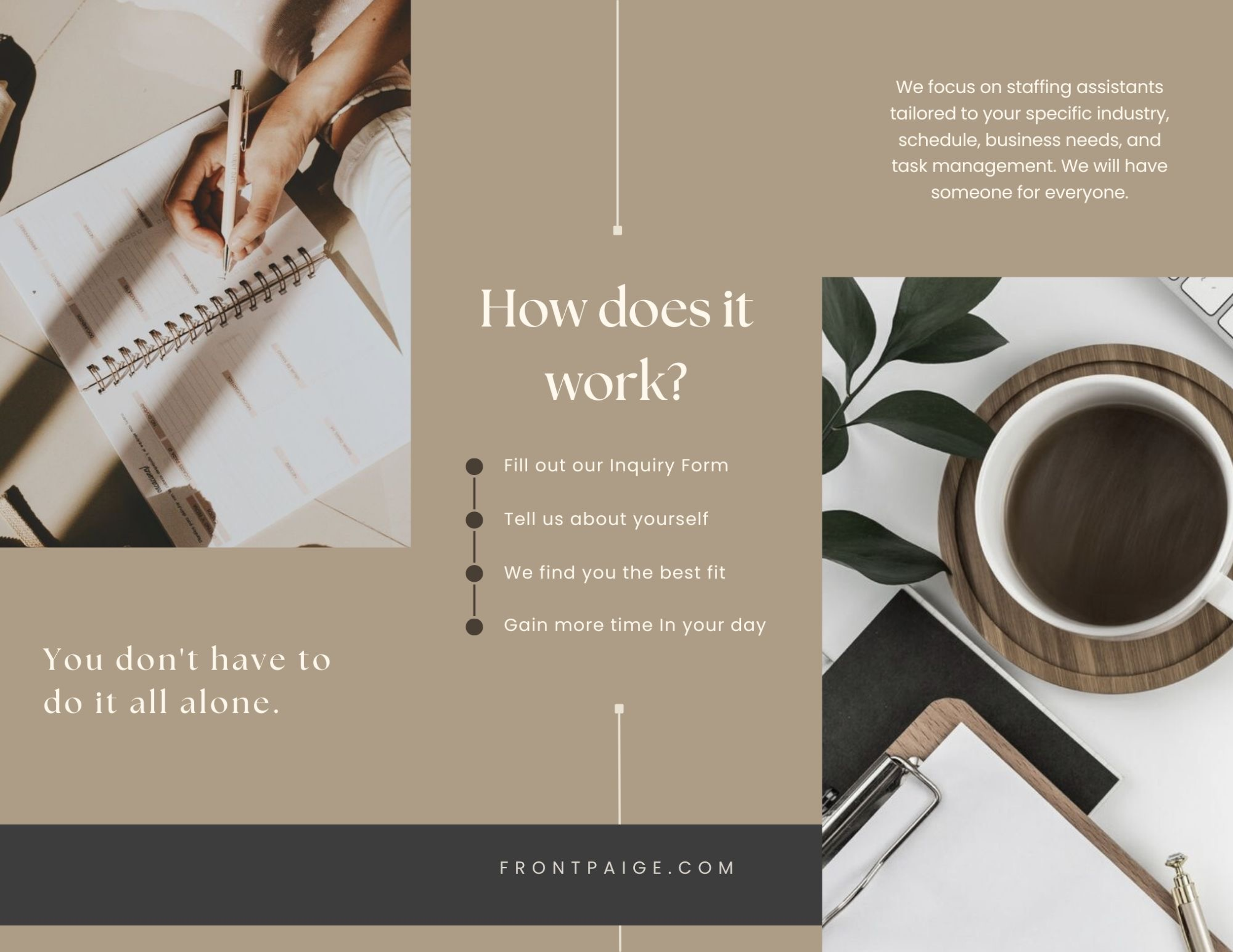
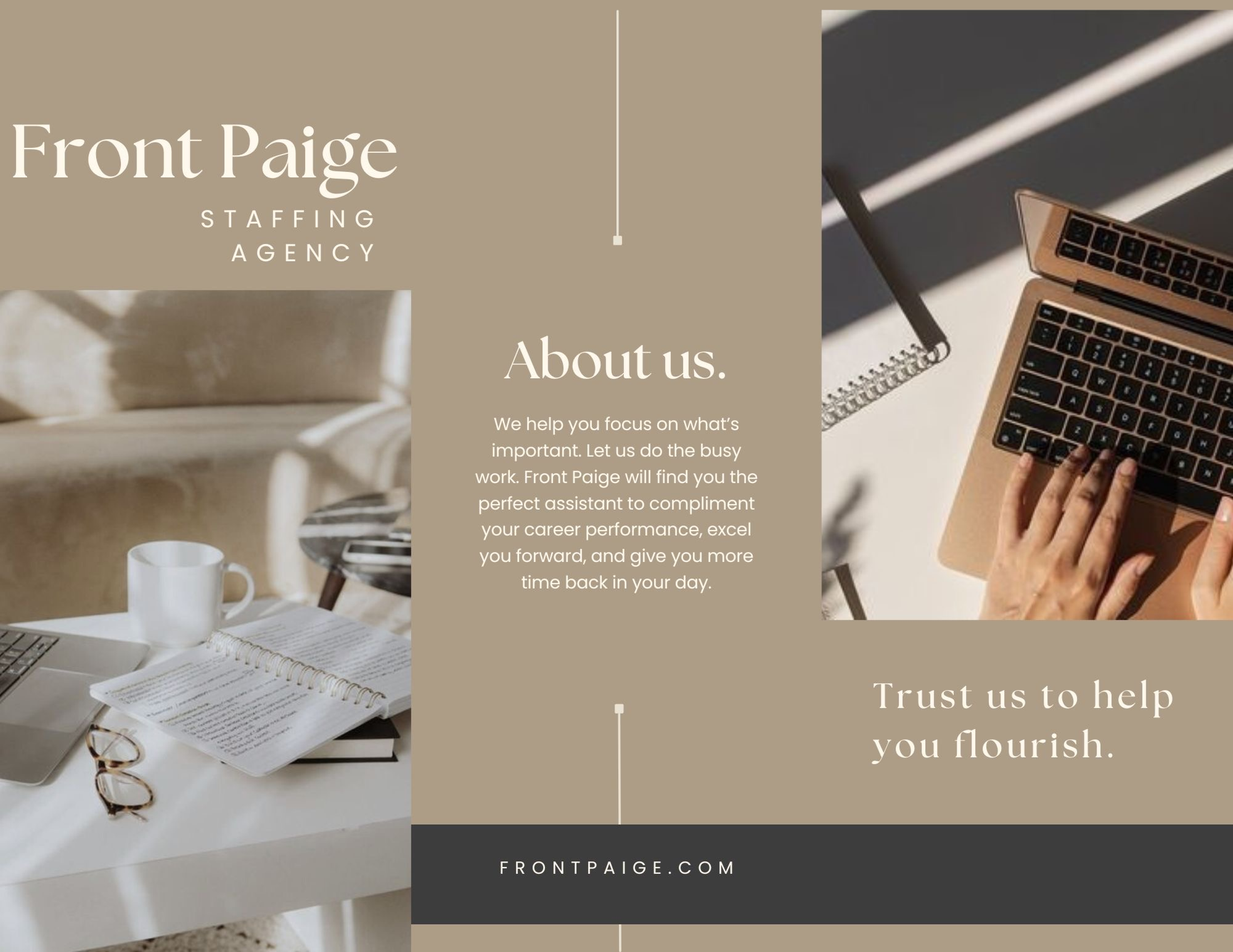
As inspiration for the branding design, she provided me with two images on the right. I used these images to create the color palette and to determine the final imagery for the website.
Using Adobe Color Wheel I extracted the colors from the bottom image to create the color palette for the website.
Logo & Typography
I researched modern fonts that are minimalistic and complement each other. This led me to choose the fonts below.
Additionally, my client decided to keep the name “Front Paige” as the logo for the brand instead of creating an icon.
User Flows
At the beginning of my design process, I focused on creating the user flows that Jamie would take when browsing the website. This involved mapping out the various paths and actions that Jamie might take, as well as considering the different features and functionalities that would be important to include.
I wanted to ensure that the user experience was as seamless and intuitive as possible, so I put a lot of thought into the layout and design of the website.
Sketches
After completing the user flows, I started sketching screens and did a "Crazy 8" exercise to plan out the pages and their contents. This involved mapping out how each page would lead to the next and what elements each screen would need in order to prompt the user to take the next step.
Wireframes
After completing my sketches, I designed low-fidelity wireframes and tested them with users to identify any flaws or confusion. Based on this feedback, I made minor adjustments to the screens, which can be seen in the high-fidelity prototype below.
High - Fidelity Prototype Mobile
Deliver
Usability Tests
When testing for usability on the mobile and desktop versions, I wanted to make sure both had a simple flow that made sense to the users. Additionally, it was important that it was visually minimal so users could find the information they needed and then leave when finished.
I accomplished these markers as well as garnering the comment that the site felt “trustworthy.”
“It feels trustworthy. The transparency of the process adds to that aspect. I like the simplicity.” - User One
“It’s simple and not overwhelming” - User Two
“Simple. Minimal. Straightforward.” - All users
Final Thoughts
Successes
The Front Paige website follows a simple user flow that saves the users time when finding an employment match. Users said the site feels “trustworthy” and “user centric.”
Opportunities
I gained confidence in myself as a designer. I enjoyed working with my client to create a website that she would love and be able to use. I am excited to continue developing my design skills, especially in UI.


